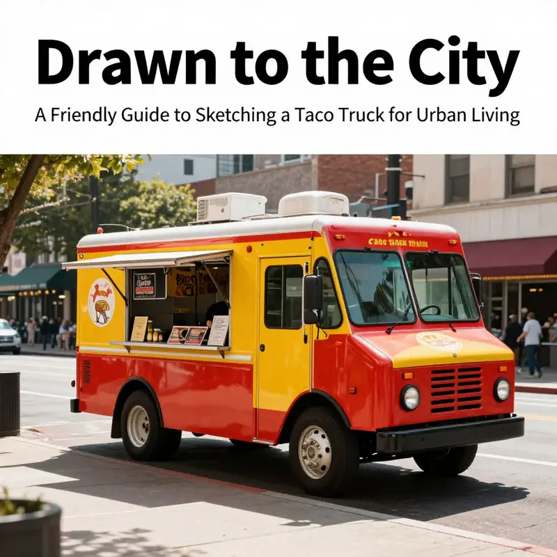
City life thrives on quick, visual stories. Learning how to draw a taco truck blends practicality with play, giving urban commuters, outdoor enthusiasts, freelancers, and aspiring pickup buyers a tangible, portable project. This guide offers a friendly, authoritative approach: start with a simple silhouette that mirrors real-world trucks, then layer in details that convey function, branding, and personality. By breaking the process into three chapters, you’ll move from the skeletal math of a shape to the lively character of signage and color. Think of each step as a small business sketch you can reuse in pitches, neighborhood events, or your own portfolio. Whether you’re doodling on a lunch break, planning a weekend market setup, or teaching a beginner how to draw, the taco truck becomes a versatile metaphor for mobility, creativity, and steady progress on the sidewalk of city life.
Foundations in Frame: Sketching the Taco Truck’s Bold Body and Roof
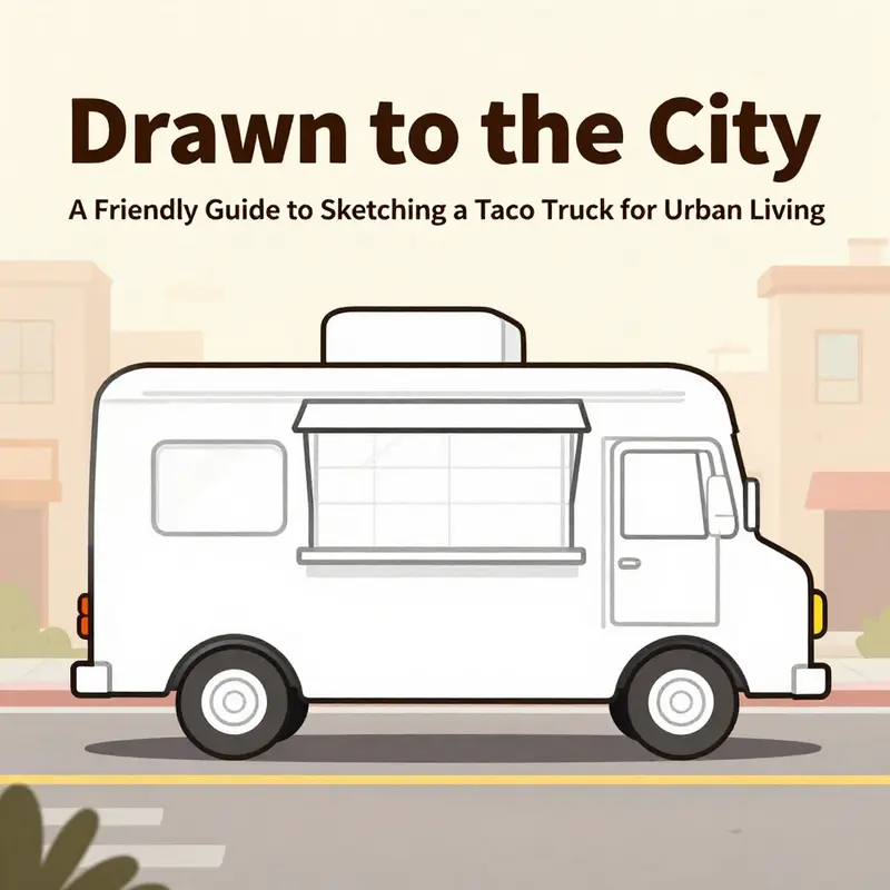
The act of drawing a taco truck begins with a deliberate pause at the frame—an acknowledgement that the vehicle’s character is born from its silhouette as much as from its color. In this first chapter, you learn to translate a practical service unit into a friendly, eye-catching form. The main body and the roof are not mere shells; they are the stage on which function, culture, and personality perform. The goal is a clean, scalable starting point that makes the rest of the design feel inevitable rather than improvised. When you draw, you are laying down a foundation where every line serves a purpose, guiding the eye from a sturdy chassis to a welcoming service window, from a roof that carries light and signage to a body that feels ready to roll out into the world with peppers and steam in its wake.
Begin with the main body as a large, elongated rectangle. This is the truck’s backbone, the space that will hold the kitchen equipment, the counter, and the customer-facing windows. Make the top edge slightly wider than the bottom. This subtle widening adds dynamism, a sense that the truck is a living thing designed for movement, not a static box. The rectangle should feel sturdy, like a platform built to carry heavy pots and hopeful customers alike. As you sketch, imagine the chassis beneath as a solid line of support—engine, wheels, suspension—so the body sits with confidence rather than floaty whimsy. The proportions matter here. The body should read as long and lean, but not oversized; the goal is balance between practicality and a welcoming profile.
When you move to the roof, place a smaller rectangle above the main body. The roof should rest with purpose, often flat or gently arched, and it can extend beyond the front and rear edges of the body. This overhang is more than decorative; it protects the service counter and signage from sun and rain, and it gives you room to play with lighting fixtures, antennas, or a lighted sign that feels integrated rather than tacked on. A roof that projects slightly forward can also help the viewer read the truck as a functioning mobile unit even from a distance. Keep the roof line clean and continuous. A jagged edge or abrupt changes in height can break the sense of unity you are building. If you draw with perspective in mind, you may tilt the roof just enough to hint at three-dimensional depth without complicating the simplest, most readable form.
Next, define the service focus by sketching the windows and doors. Inside the main body, add two or three small rectangles to represent the windows. A few light horizontal lines inside each window can suggest glass catching the sun or the glow of interior lighting. Position the service window near the front of the truck; this is the place where the customer’s attention will settle first and where the story of the truck begins. The front edge of the window should be slightly inset, avoiding the trap of a window that looks like it’s cut too squarely into the side. Your aim is a confident window that feels easy to reach and easy to understand at a glance. If you want to add a door, sketch it as a vertical line or a slender rectangle along the side, leaving space for a handle that won’t interrupt the clean rhythm of the body.
With the core shapes in place, you begin the careful calibration of proportion. A classic taco truck often sits on a robust chassis, so the body sits above the wheels with a small gap that hints at interior clearance. In many real designs, the wheelbase reflects the type of vehicle the unit borrows from, whether a cargo-van origin or a custom box build. If you prefer a grounded, grounded feeling, you can draw two slightly oversized wheels toward the front and rear to imply stability. If you want a more compact, nimble look, a shorter wheelbase with larger wheels can work. The point is consistency: ensure the wheels align with the body’s vertical edges and that the overall stance communicates readiness for service rather than a mere parade float.
As you refine the form, begin to think about the stylistic language that will dominate the truck’s surface. Taco trucks are celebrated for bold, celebratory color and strong graphic language. You are not just outlining a piece of machinery; you are shaping a mobile brand on wheels. This is where you can start to imagine color blocks that will someday become tacos’ vivid wrappers and chips of ornament. Consider a color strategy that balances visibility with warmth—a sunny yellow or warm red body paired with cooler accents to hold its own alongside signage. The roof, though secondary to the body, can carry a line of light fixtures or a small banner. It’s a place to cue the eye upward and give the truck its signature silhouette. In practice, you will often see a roof that carries a simple, clean extension of the body’s color field, with the possibility of small neon outlines or flag elements that pop at dusk.
The decorative layer comes next, and it should be read as part of the truck’s function as a moving advertisement and cultural beacon. You might sketch a few bold motifs along the side walls—a flourish of peppers, an abstract sunburst, or a row of geometric patterns that nod to folk art. These details aren’t afterthoughts; they communicate the truck’s heritage, its culinary intentions, and its neighborhood’s pride. You may sketch a grill icon or decorative steam lines that suggest the cooking happening just out of sight. The key is restraint. Too many motifs can overwhelm the form; a few strong marks will feel deliberate and purposeful. If you are inclined to include text, keep it tight and legible. A sign above the display area or along the side can read “TACOS” or “DELICIOUS TACOS” in bold, simple typography that reads quickly when the truck is in motion.
The display area—the taco window—begins to take shape as a practical feature and a focal point. Draw a large, open rectangle or curved opening near the front that serves as the display counter for the tacos. This feature should look inviting rather than bustling with detail. You want enough room to suggest a counter, an order slot, and a glimpse of the interior workflow without crowding the viewer. The display area acts as the storytelling hinge: it’s where customers imagine the steam, the aroma, and the sizzle behind the glass. To emphasize accessibility, you can include a small counter ledge just beneath the window line, which helps anchor the service experience in the drawing. The counter also becomes a compositional anchor that balances the weight of the sign above it and the display’s openness below.
Shadows and texture are your next tools. A taco truck’s surface can be treated with simple indicators of rivets, panel lines, and a few light textures that suggest metal panels without overwhelming the design. A few subtle vertical or horizontal lines can convey panel separations and door joints, reinforcing the idea that this is a built object with a carefully planned interior. Shadows under the wheels ground the vehicle in space, while a faint wash along the lower edge of the body can hint at grip and wear from long days on the road. The goal is tactile clarity, not photorealism. The entire structure should feel cohesive, a single, confident silhouette that looks right in profile and remains readable from most angles.
Color brings the concept to life. You will want to imagine a palette that feels warm and inviting, with combinations that can carry through to banners, stickers, and interior accents. Warm tones like red, orange, and yellow create a sense of energy and appetite, while greens or blues can introduce contrast for signage, logos, and highlights. The wheels are best kept dark and solid to ground the frame, serving as a counterpoint to the bright body. As with any design project, color should be read in large blocks first, then refined with small accents for texture and depth. The result is a taco truck that seems to glow with personality even before the first line of ink is laid down on the service window.
Perspective and proportion must be revisited occasionally as you proceed. If you are working in a frontal view, keep the sides parallel and the roof level. A 3/4 view adds a touch of drama by showing the front and side simultaneously, with the roof line slightly receding toward the back. In either case, verify that the main body remains approximately two to three times longer than its height, and that the roof’s overhangs extend only modestly beyond the front and rear boundaries. The point of these checks is not pedantry but readability: you want the observer to instantly recognize a taco truck and its service intentions without wrestling with the geometry. When in doubt, measure with a light eye and let the drawing breathe. A clean rhythm between the large blocks and the smaller details will carry you through the next steps of your design journey and into the chapters that will add the kitchen, signage, and interior layout.
In this stage, you are building more than a cute doodle. You are creating a compact, scalable blueprint for later development. The main body and the roof set the stage upon which a world of interior equipment, customer interaction, and brand storytelling will rise. A well-defined base makes room for the display window, the service counter, and the decorative elements to feel intentional rather than accidental. You will know you have achieved this balance when your drawing reads clearly at a glance: it is unmistakably a taco truck, sturdy enough to pull into a neighborhood, friendly enough to invite a line of hungry people, and flexible enough to adapt as the design evolves.
The practice of sketching, then, is a practice of restraint and intent. You are not chasing the most complex linework or the most photo-like rendering. Instead, you are crafting a strong, legible framework that will support the kitchen’s real-world needs and the brand’s narrative. Real-world guidance from industry standards emphasizes modular, box-like body designs for efficiency and interior space optimization. That practical wisdom aligns nicely with the artistic aim: a boxy but lively form that accommodates interior layouts, service workflows, and durable finishes. As you work, imagine how this frame will translate into blueprint, CAD file, or any eventual construction plan. The more confident your initial frame, the smoother the journey toward the later chapters that add the gas range, ventilation, signage, and interior organization.
For readers who want to see how these shapes translate into real-world practice, consider exploring the broader conversation about sustainable and efficient mobile design. A resource on sustainable practices for mobile trucks offers a perspective on how a well-conceived frame supports eco-friendly choices, from efficient routing to solar options and beyond. This link is provided to encourage a more holistic approach as you sketch and plan: Sustainable practices mobile trucks.
In the end, the foundations you set in this chapter—the main body’s length, the roof’s line, the service window’s location, and the gentle confidence of the bulk—will echo throughout every subsequent drawing. The main body and roof are not mere starting points; they are the scaffolding that will hold your entire taco truck design together. When you return to them after drafting the kitchen, counter, or sign panels, they will feel like an old friend whose proportions you already know by heart. With a solid frame, your creative choices—color, motifs, signage, and interior layout—will have room to grow, without sacrificing the clarity and charm that first drew you to the idea of a taco truck on wheels. The journey from here to a finished sketch is not a sprint but a careful, unfolding conversation between utility and whimsy, between gravity and celebration, between the road ahead and the plan you hold at your desk. And that conversation begins with one confident rectangle, one eager roof, and a reminder that the best vehicles of delight are born in lines you can trust.
External resource: For a broader perspective on how color and form carry cultural meaning in food-truck design, you can explore Smithsonian Magazine’s feature on The Art of the Food Truck, which traces how visual storytelling shapes communities and kitchens on wheels. https://www.smithsonianmag.com/arts-culture/art-food-truck-180981477/
Chapter 2: Framing Flavor—Detailing the Taco Display, Windows, and Signage for a Lively Taco Truck
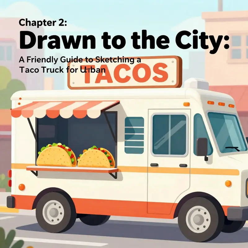
The chapter you are about to read treats a taco truck not just as a vehicle, but as a portable stage where color, texture, and appetite come together. In the previous pages you laid down the basic silhouette, a sturdy rectangle for the body and a roof that suggests movement even when the truck sits still. Now the focus shifts to three connected stages of personality: the taco display, the service window, and the signage that announces the van’s spirit to passersby. Each element is a chance to tell a story about what the truck serves and how it greets the crowd. When you draw with this mindset, the lines become directional cues. They guide the eye toward the most flavorful details, while the surrounding chrome, glass, and paint translate energy into a visual appetite that your viewer can almost taste.
Start by imagining the windows as more than panes of glass. They are frames for the food’s first impression. Large, clear windows work best for a cartoonish yet convincing look, especially if you want to display a row of tacos with just enough linework to suggest their fillings. Place one or two dominant windows toward the front or side so the viewer’s eye travels naturally along the truck’s length. Inside these windows, sketch subtle counter lines to imply a serving shelf. A light, almost translucent rail can separate the customer space from the taco display, creating a sense of depth without clutter. The glass should catch a hint of reflection, a soft gleam that signals a bright day or a neon glow at night. Use gentle shading to imply depth behind the front glass; lighter tones where the light would strike the display and darker tones toward the back to suggest the interior shadow.
Now for the taco display itself, the heart of your visual menu. The display area is where appetites are teased and decisions are made. Draw a few stylized tacos arranged in a row or a small stack. Each taco can reveal a different type—beef, chicken, or a vegetarian option—so the viewer reads variety at a glance. Let the fillings peek out with a few simple lines that hint at lettuce, cheese, salsa, and herbs. The goal is not photographic realism but visual clarity: a taco whose shape and toppings are instantly recognizable. Add a tiny garnish, such as a lime wedge or a cilantro sprig, to give the scene a pop of color. If you want a touch of character, place a small chili pepper icon or the word ¡Caliente! near the display. These small cues are not just decorative; they reinforce flavor and authenticity, guiding the viewer’s interpretation of the cuisine the truck offers.
To ground the display in the world of the vehicle, integrate a few structural details that a real taco truck would carry. Draw a light shelf or rack along the inside edge of the window to hold condiments and toppings. On the counter, a row of tiny containers can suggest sour cream, guacamole, onions, and lime wedges. These items anchor the display in practicality and make the scene feel lived in rather than purely decorative. The presence of these small elements is important because it signals that the truck is not a static art piece but a functioning mobile kitchen. The viewer perceives a story: someone will soon assemble a fresh taco right behind that glass.
Signage sits above the display like a bold exhale of color that announces the truck’s personality. A large sign above the windshield or along the side acts as the day’s ambassador, catching light and attention from a distance. Use vibrant, high-contrast colors inspired by traditional Mexican palettes—reds, yellows, oranges, greens—yet keep your palette coherent so the truck looks unified, not carnival-bright. The font choice matters as much as the color. Opt for a hand-drawn or decorative typeface that feels friendly and curvy, almost as if the letters themselves were sprinkled with seasoning. Names such as Taco Loco, Salsa Express, or El Taco Gigante can be suggested through a few organic letterforms rather than rigid, mechanical type. Add decorative flourishes like swirls, little sunbursts, or tiny cacti to frame the letters. Consider a secondary line of text beneath the main name: a slogan like Fresh Hand-Made Tacos or Open 10 AM – 8 PM. This secondary line should be smaller but legible, balancing the composition without competing with the main name.
Small touches around the sign can ground it in reality. A faint reflection on the sign’s surface, a soft drop shadow on the truck body, or a slender rim of light along the sign’s edge will make it feel anchored rather than perched above the vehicle. If you are illustrating a night scene, neon lights around the sign or a warm glow from the display window will create a cinematic effect. When you imagine light, think of how it travels across the surface: the curved roof catches a hint of sunlight; the sign catches a glint; the glass reflects a cool streetlamp. By considering these light interactions, you turn flat color into a living surface.
To this core, add exterior elements that reinforce the character of the truck without overshadowing the display and signage. Small shelves or racks near the window can show condiments, napkins, or a sizzling metal grill visible through a side window. A cooking heat source tucked behind a back panel or side opening can suggest that the tacos are prepared fresh on the spot. These elements are not merely there for realism; they are narrative signposts that tell the viewer how the truck operates. A personal touch such as a graffiti-style mural, a bumper sticker that reads Tacos > Traffic, or a tiny flag fluttering from the roof adds a sense of ownership and pride. If you intend a night scene, plan for glow: the counter lights, the display light, and the sign’s edge should all cast a warm halo that makes the truck look inviting from across a crowded street.
As you refine the look, think about color and texture in a way that makes every feature feel tactile. The body of the truck can be a bright, clean surface or a playful combination such as white with bold accents. The signage should sing with saturated hues that still feel cohesive with the display. The taco fillings on the display can hold hues of golden tortillas, green cilantro, red salsa, and creamy white sour cream; the contrast between these colors helps each element pop. For textures, use crosshatching or fine stippling to describe the metal frames around the windows, the glossy glass of the display, and the rougher surface of the paint. Smooth gradients can describe glass and light reflections, while sharper, lighter lines can suggest rivets, panels, and the contours of the truck’s body. If you want to push further, you can shade the window frames to imply metal’s coolness and the warm gloss of the display glass catching the sun.
In this stage of drawing, you are choreographing a visual conversation between the customer’s eye and the truck’s interior world. The display hints at the menu inside and invites a closer look, while the window acts as a barrier that is permeable enough to show the activity inside yet sturdy enough to suggest a professional kitchen. Signage, meanwhile, communicates the brand’s voice and promise at a glance. The color choices should support both readability and mood: red for appetite and urgency, yellow for warmth and cheer, green for freshness, and a touch of black or dark gray to anchor the design with a sense of reliability and craft. The best combinations keep the eye moving along the truck from front to back, leading it first to the sign, then to the window display, and finally to the supporting details that prove the scene’s authenticity.
If you wish to connect these ideas to practical drawing practice, consider how you would adapt the scene to a real-life situation. A restaurant-style interior would choose precise, clean lines and restrained color. A street-food aesthetic invites bolder shapes, more playful typography, and more visible cooking activity. The taco truck sits on the border between these two approaches. It is a compact kitchen on wheels with a showman’s flair, and your drawing should reflect that balance. You can achieve it by letting the sign and display carry most of the visual weight, while the rest of the truck remains clear and legible with enough negative space to keep the composition breathable.
Incorporate a few internal reminders as you work. The windows should remain large and prominent, because they anchor the display and define the consumer’s point of view. The taco display should feel delectable, almost edible, so the viewer perceives color and texture with a viewer’s appetite. The signage should be easy to read at a distance, so the truck communicates even while it is moving or parked on a busy street. In other words, the drawing should read like a small, dynamic advertisement, where color, texture, and placement create a single, cohesive message.
To further connect the drawing with real-world practice, here is a practical nudge you can apply while you work. When you design the signage, aim for a strong focal point and a secondary line that expands the message. The focal point can be the name in bold, rounded lettering, while the secondary line can offer a brief descriptor of the offerings. Keep the typography readable at a distance by using thick strokes and ample letter spacing. When you sketch the tacos in the display, use a few curved lines to imply the tortillas’ softness and a handful of jagged lines to indicate grated cheese or shredded lettuce. The combination of smooth curves and crisp edges will make the display lively and appetizing without sacrificing legibility. The final effect should be a taco truck that feels both credible and inviting, a vehicle that appears ready to roll and ready to serve at a moment’s notice.
As you integrate these details, consider your chapter as a bridge between concept and craft. The words that describe the taco display, the window, and the signage also describe how you connect with your audience. The display invites appetite; the window promises service; the signage proclaims identity. Each element reinforces the others, creating a visual macro-story of flavor, hospitality, and mobility. If the sequence works, a viewer who glances at the truck from across the street will not only recognize the signage but feel drawn to the display, imagining the sizzle and aroma that follows the first bite. That is the power of careful detailing: it converts a static drawing into a narrative you can taste with the eye.
For artists who want a quick practical waypoint while staying within a cohesive workflow, consider a simple revision loop. Step back, observe the balance of the truck’s front and back. Are the windows dominant enough to frame the display? Is the sign easily legible from a distance or does it require your viewer’s eye to come closer? If either answer is uncertain, tweak the scale or adjust the color contrast until the focal points feel intentional. Remember that the goal is not to replicate a real truck with hyper-accurate precision but to capture the spirit of a taco truck in motion, a mobile festival of color, light, and aroma that translates confidently onto paper.
As you approach the final pass, you might choose to add subtle silhouettes of customers through the windows or a quick suggestion of a street scene reflected in the glass. These touches are optional but can deepen the sense of place without clutter. The most successful drawings keep the core elements—the taco display, the service window, and the signage—clear and legible while letting the rest of the composition breathe. In that balance, you’ll find a taco truck that feels ready to pull onto a sunlit avenue or glide along a late-night corridor, always prepared to serve a hungry crowd with warmth and flair.
A final thought on process: let the drawing teach you what to emphasize. If the display seems flat, push the shading around the tacos to create roundness and volume. If the sign reads oddly at a distance, boost its contrast and simplify the lettering. If the window feels crowded, pare back decorative elements and leave the focus on the display. The beauty of a simple concept is that small, thoughtful adjustments can transform a modest sketch into a memorable illustration. And as with any chapter in this guide, your own stylized voice will emerge through repetition, confidence, and a willingness to experiment with color, line, and composition.
For readers who want a little additional direction on visual references, a freely available source offers a structured approach to food truck branding and illustration, which can inform your choices about color and layout in a way that complements the drawing practice described here. Consider exploring this external resource for broader design concepts that can enrich your taco truck visuals: https://www.designmantic.com/blog/food-truck-design-tips
To keep your exploration connected to practical, real-world design decisions, you may also want to glance at related industry content that discusses branding and equipment choices for mobile kitchens. A thoughtful, well-balanced approach helps ensure that your art remains grounded in the realities of how these vehicles operate and how customers perceive them on the street. If you enjoy applying these ideas to your own work, you’ll find both the display and the signage becoming more than decorative features; they will become the core signals that communicate flavor, quality, and personality first, and then encourage a viewer to imagine what it would be like to step up, order, and savor.
Internal link note: in the spirit of connecting drawing to practice, you can consider how the concept of choosing the right equipment might inform decisions about what details to emphasize in your illustration. For a concise guide on how to think about equipment choices in a real-world taco truck context, explore this resource: Choose Food Truck Equipment Wisely. This reference is not a substitute for your artistic process, but it can inspire practical considerations when you create a scene that feels both believable and imaginative. As you move forward, let the interplay of display, window, and signage continue to guide your line work, color choices, and storytelling intention, so that your taco truck on the page becomes as inviting as the real thing when it rolls into view.
The journey from base shape to lively detail is not merely a series of steps. It is a dialogue with color, light, and appetite. When you finish the chapter, you should feel the truck radiating personality through its display and its voice through its sign. The viewer should almost hear the sizzle and smell the cilantro as they imagine the first bite. This is the essential aim of depicting the taco truck: to translate street flavor into a memorable image that travels with the eye as effortlessly as the truck travels on the road.
References and finishing touches: if you want to extend your study beyond the scope of this chapter, study a range of vintage and modern taco trucks in both real life and illustration. Observe how the best designs use color blocks to separate zones, how the sign’s typography balances readability with character, and how the display becomes the anchor of the entire composition. The more you observe, the more confident your hand will be when you commit to the final lines and colors. When you look back on your finished drawing, you should feel that the windows, the display, and the signage are not merely decorative features but essential storytelling devices that invite the viewer to step closer and share in the experience of the truck’s flavor.
By embracing this integrated approach to detailing, you lay the groundwork for subsequent chapters that will explore how to convey motion, how to stage a street scene around the truck, and how to suggest context through background elements without overpowering the focal points you have carefully established here. Your taco truck drawing has become more than a static image; it has become an invitation to taste, to watch, and to stay a little longer as the world goes by.
External resource referenced above provides a broader design perspective and practical tips on branding for food trucks, which can complement the artistic discipline described in this chapter.
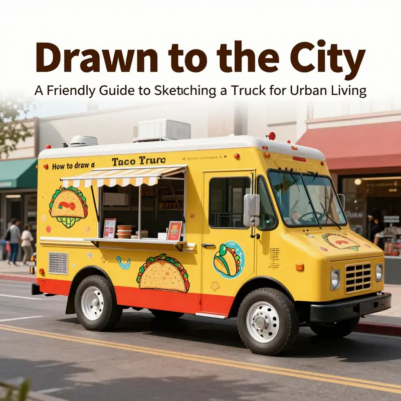
Chapter 3: Bringing Flavor to Life — Finishing Touches, Color, Accessories, and Presentation for Your Taco Truck
Color is the heartbeat of your taco truck drawing, the spark that takes a simple blocky vehicle from a schematic into a scene with personality and appetite. The finishing stage invites you to translate lines into atmosphere, to render heat and movement with light, and to let the truck tell a story about the people who would park on a sunny street to buy a warm, fragrant taco. Start with the palette in your mind and then test it on tiny swatches, watching how the chosen hues interact when they meet metal, glass, and fabric. Real taco trucks glow in warm tones—reds and yellows that shout from a distance, punctuated by cooler blues or greens that balance the heat and keep the whole composition legible at a glance. A good rule of thumb is to treat the body as a field of color that catches the eye first, while the service window, grill, and sign act as focal points that invite closer inspection. The goal is not to replicate every detail of a real machine but to capture the sense of motion and flavor in a single, confident gesture.
From there the work becomes more deliberate: you choose color families for each major component and then weave them together with shading and highlights that suggest curvature, light direction, and age. If the body is painted a bright red or sunlit yellow, the edges should glow slightly where the sun would strike, while the panels along the sides accrue cooler shadows that push the middle of the truck forward in space. Use a light hand with highlights on chrome trims, wheel rims, and the edge of the sign to convey the way metal reflects both sun and street light. It’s not necessary to overrender every rivet, but a few well-placed lines around the doors, windows, and panel seams will imply the truck’s construction without crowding the image. The trick in this phase is balance: too many bright accents can overwhelm the composition, while too few can make the scene feel flat and borrowed from a different era. The aim is to keep the truck looking modern in energy, even if you drew it in a deliberately cartoonish style.
Texture is your ally here. The metal of the body can carry a subtle grain or a gentle metallic sheen that hints at enamel paint. A few short crosshatch strokes along the panels can simulate rivets without interrupting the smooth flow of the overall silhouette. The glass windows deserve a crisp, glassy finish with a slight tint that suggests reflection but does not obscure the view inside the truck. Inside the service window, a thin line of white or light gray can imply the edge of a counter, while a hint of steam or a wisp of smoke can be drawn with a soft, curved shape to suggest the grill behind it without committing you to a complicated scene. If you’re creating a display area for tacos, a curved display shelf can be indicated with a bold arch, a couple of short lines to show the shelf’s edge, and a cluster of small shapes that read as tortillas, shells, or steaming fillings. The point is to communicate abundance and variety with economical marks, not to recreate every detail in high fidelity.
Signage and branding are not mere afterthoughts; they are the main tellers of the truck’s personality. The sign above the display should be a rectangle with bold, legible letters that read something quintessentially street-food in tone—short, punchy, and easy to read from a distance. You can try a curved top on the display to mimic a raised hood or a retro neon frame that hints at energy and night markets. If you choose neon, render the tubing as a single thick line with a bright glow around it, and keep the glow contained to avoid bleeding into other elements. A chalkboard menu mounted near the service window adds a friendly, ephemeral touch: a few hand-drawn items, prices, and a wink of humor can convey the local, casual vibe of a taco stand. The chalkboard’s texture—slightly rough, with uneven edges—contrasts nicely with the glossy panels elsewhere and helps guide the viewer’s eye around the composition. Beneath the sign, the counter line should be sturdy and simple, anchoring the scene and making the viewer feel the moment of ordering where flavors become action.
Decorative details transform a roadside vending vehicle into a neighborhood landmark. Colorful decals or stickers on the sides create a lively rhythm across the truck’s length, while a small awning or canopy above the service window adds depth and a sense of shelter for the customers. The awning is a perfect opportunity to introduce a second color family or pattern without stealing focus from the primary color scheme. Consider a few banners fluttering from the edge of the awning, perhaps with a repeating motif that echoes the truck’s branding, such as a geometric pattern or a stylized chili pepper. A mascot painted on the side—imaginative, friendly, and not too complex—can become a memorable signature for the design, as long as it remains legible at a distance. The mascot should be a simple silhouette or a bold figure with clear edges so it reads well in thumbnails and larger formats alike. If you want to push the presentation further, a small radio antenna or a tiny, cheerful figure perched near the top corner can suggest personality without crowding the roofline.
The service window itself is a small theater where color, line, and shape collaborate to invite interaction. The opening should be clearly defined by a sharp edge or a slight overhang, with a counter line that invites a viewer’s eye to travel from the exterior shell into the interior. A hint of the grill and a gleam of metallic surfaces can peek through the window in a way that implies heat and activity without needing a full, intricate interior. Steam wisps rising from the grill can be represented with soft, curved strokes that curl upward in a way that keeps the drawing playful rather than realistic. You may also add tiny details, like a couple of stacked taco cartons or a row of salsa jars, using minimal shapes and bright colors. It’s these small cues that make the scene feel inhabited, a place where a family might queue for a quick bite and a moment’s escape from the commute.
Lighting is a cinematic tool as much as a technical one. A daylight scene benefits from clean, crisp shadows that help separate the truck from the background, while a night scene invites bold neon and soft reflections. If you’re illustrating a daytime street, keep shadows to one or two directions, which keeps the composition readable and friendly. If you favor a night setting, the neon should be the strongest light source, so paint it with a saturated glow that spills onto nearby panels. The reflections on the wheels and the chrome trim can mirror this glow, linking every part of the truck to the same event—dining on the curb, meeting neighbors, and sharing a moment of flavor innovation. In either case, the goal is to maintain visual cohesion: the light source should feel intentional, not accidental, and every color should participate in that shared atmosphere rather than compete with it.
As you layer the color, think of the truck as a stage. The audience is the curb, the passerby with a camera, the kid on the bike who slows to wave at the mascot. Your job is to choreograph the colors so they guide the eye through the stage directions: the eye moves from the bold body color to the sign, then to the service window and the display, and finally lingers on the subtle textures that promise longevity and daily life beyond a single drawing. To keep the composition cohesive, you can apply a unifying glaze—a thin, transparent wash or a subtle color overlay—that links the various zones. This technique helps to prevent color distractions and ensures the ensemble reads as a single, confident piece.
The chapter’s living thread is the narrative you tell through color and detail. The truck is more than a machine; it is a mobile microcosm of a community, a place where food becomes a social ritual. The textural choices—gloss on chrome, matte paint on panels, rough wood of the counter, and the crisp whiteness of a chalkboard menu—work together to create a tactile sense of what it would feel like to walk up, read the menu, and place an order. It’s not about accuracy to a real vehicle but about an emotional truth: the promise of warm tortillas, the shimmer of heat, the cheerful chorus of color against the street’s gray. In that spirit, you can weave in a small, hopeful layer about community. A well-chosen caption or a title for your artwork can summon a neighborhood’s shared memory of street food and summer evenings. You might frame the piece with a short, catchy line that evokes movement and warmth, a phrase that anchors the image in a moment where people pause, smile, and remember their favorites.
To deepen the narrative without clutter, weave a few details that hint at the truck’s origin or ethos. Perhaps a tiny emblem near the rear wheel suggests a local family business, or a badge that nods to a city’s cultural celebration. You can also imply a backstory through color choices—the red body signaling bold, fiery flavors; the yellow accents suggesting corn tortillas and sunlit mornings; the blue or green trims hinting at fresh ingredients and sustainable practice. The taste of the drawing becomes legible in these carefully chosen cues. If you want to encourage viewers to linger, add a final flourish: a neatly framed title such as “¡Sabor en Ruedas!” (Flavor on Wheels) that sits like a badge on the truck’s flank, paired with a short description of the scene beneath it. This approach invites the viewer to read the image, to discover the tiny jokes and the wider story that you’ve encoded with color and form.
In a broader sense, your final step is presentation. A clean, framed drawing with a tasteful balance of color and negative space communicates that you’ve treated the taco truck as a performer rather than a mere object. The framing dictates how the eye enters and exits the scene, how long it lingers at the service window, and how the decorative elements ring around the core. The description beneath the image should be short but evocative, offering a line or two about the scene’s mood, the colors used, and the sense of community you intend to evoke. If your chapter is part of a larger article about drawing a taco truck, the description can also connect with the other sections by highlighting how color, form, and accessory choices reinforce a consistent brand voice for the truck’s fictional or real-life identity.
A thoughtful, story-forward approach can also incorporate a nod to real-world inspiration without drifting into literal replication. For instance, you might reference a design ethos that emphasizes accessibility, affordability, and warmth—the same values that make a neighborhood taco stand a beloved stop. When you frame the artwork with a title and a short fun fact, you give viewers an entry point into the story you’ve created, one that makes the image feel alive long after they move on to the next page. If you’re presenting the piece in a gallery or on a teaching page, consider including a small panel about the choices you made: why you chose a certain color palette, what the signage communicates, and how the composition helps viewers feel invited rather than overwhelmed.
Finally, remember that your internal link can help readers see how these design decisions relate to broader themes in the field. For example, you can point readers toward a case study of community-driven branding and engagement, inviting them to explore how design supports social impact. See Trucks for Change: Community Support Initiatives for a concise example of how color, form, and storytelling intersect with outreach and shared purpose. This reference is not a distraction but a bridge to a larger conversation about how artwork and real-world food culture reinforce each other in compelling, human ways.
As you conclude the drafting that leads to presentation, let the final image rest on a strong, confident posture. The taco truck should stand out without shouting. The color should feel fresh, the textures tactile, and the sign readable and lively. The display should invite a closer look, while the decorative touches should feel intentional rather than decorative for decoration’s sake. If this balance is achieved, your final panel will function as a mini-portrait of street food culture—a piece that resonates with viewers on multiple levels and invites them to imagine themselves stepping into the scene for a bite, a conversation, and a moment of shared delight.
Internal link for further inspiration and context: Trucks for Change: Community Support Initiatives.
External resource for design reference and color schemes: Taco Truck Design and Color Schemes – Food Truck Association.
Final thoughts
Mastering how to draw a taco truck is more than art; it’s a practice in visual storytelling that translates city rhythms into a portable concept. From the initial silhouette to the display, windows, and signage, each chapter reinforces how shape, detail, and color convey function and personality. For urban dwellers, outdoor enthusiasts, freelancers, and first-time buyers alike, this approach can spark ideas for street-side projects, portfolio pieces, or even a brand sketch that fits a sidewalk showcase. With consistent practice, you’ll gain confidence to adapt the taco truck concept for different spaces, lighting, and audiences while keeping the process approachable and enjoyable.